Few artists can command of the eyes and wallets of the artworld in quite the same way as Gerhard Richter. A perfunctory google search will inform you that until recently, he was in fact the single ‘most expensive living artist’. Unsurprisingly, this illustrious but ill-defined pedestal invites criticism. David Hockney, the successor to the title, is also one of Richter’s most vocal detractors.
“Richter is the one person I don’t really get. I saw the shows, but I thought it was like belle peinture, Paris 1959, and belle peinture was meant as a putdown.”1
Until recently, I was inclined to agree. The large smeary canvases that go for such extraordinary sums, seemed somewhat irrelevant to the discussions of today. They draw from a particularly masculine vein of abstract expressionism. They’re big, intimidatingly so. Sure, some of them are lovely to look at, but others are reworked to the point of being overwrought.
Suffice to say, I wasn’t their biggest advocate.
And yet yesterday, I found myself at Richter’s show at Gagosian’s Davies Street gallery. Dragged to Mayfair by glowing reviews, and quite literally pushed through the door by a friend’s enthusiasm, I had expected to be confronted with more of the same.
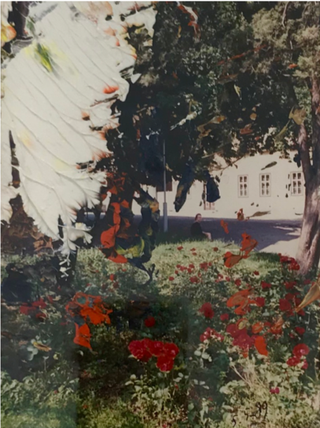
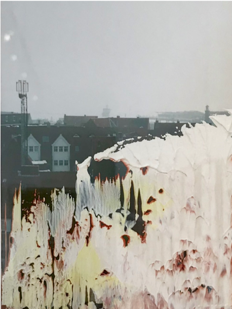
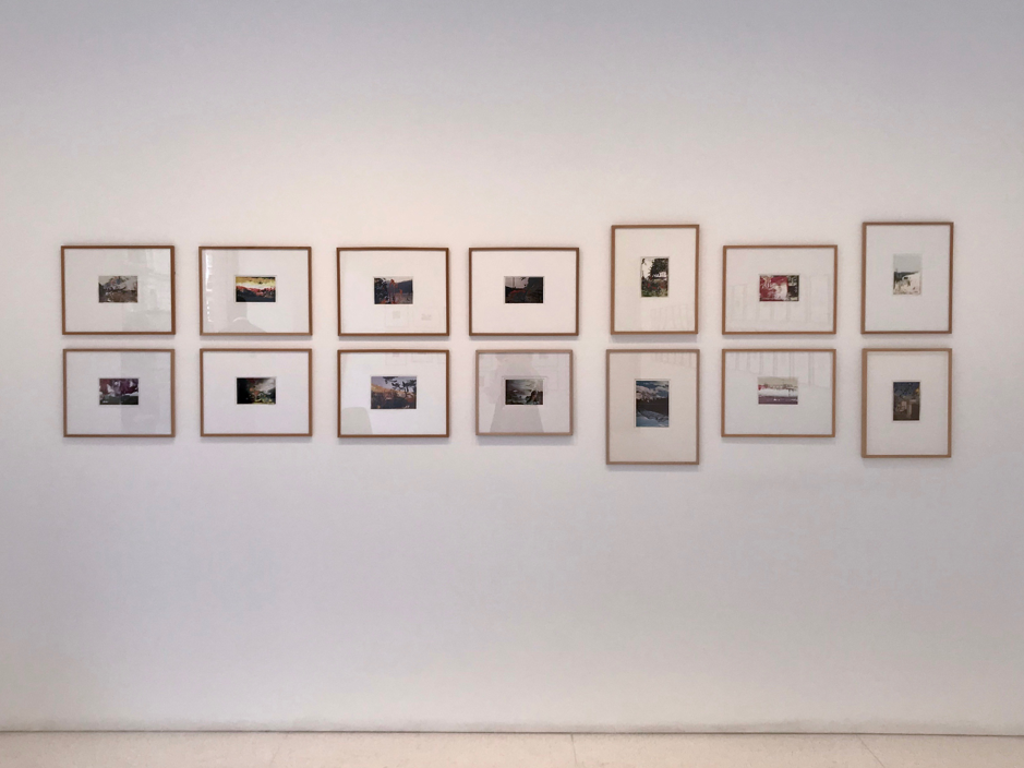
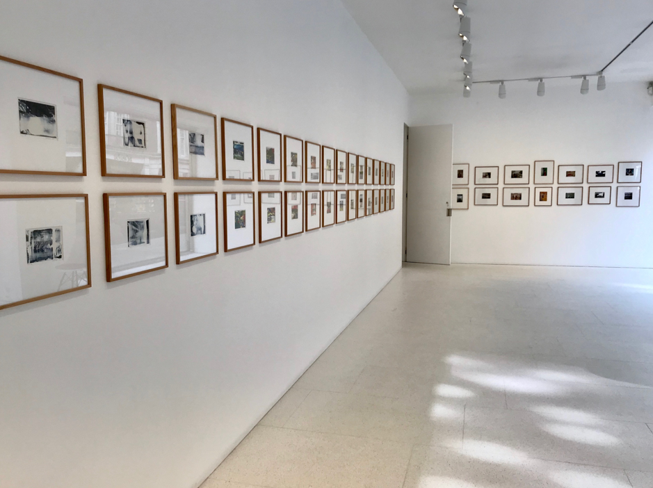
But this giant of the contemporary art world, well, he’s gone small. Instead of being overwhelmed by enormous canvases, I found myself squinting at two neat rows of photographs. Not the silver gelatin prints that are the standard gallery affair, but the good-old four by six. The kind of photograph you find in every house, in dusty albums or tossed in draws; the kind which makes the occasional debut around younger relatives, who laugh at the fact that people really did used to dress like that.
It is such a particular format, so strongly associated with family, that I find the medium itself inherently nostalgic. Even in a bright and very public gallery space, experiencing Richter’s photographs was surprisingly intimate.
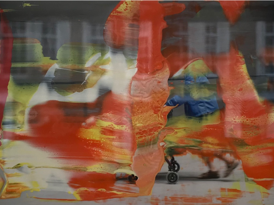
The display consists of photographs partially obscured by coloured smears of acrylic. Each daub of paint, each impress of the Richter’s various tools, gives the impression of a work just left. You can’t shake the distinct feeling that if only you’d been here a moment earlier, you’d have caught the artist in the act. Yet, it’s so artfully done that the distinction between paint and photograph is indistinct.
Much has been made of the play in Richter’s oeuvre between the media, and this exhibition proves no exception. Here the acrylic interventions lend an ineffable quality to what would otherwise be quotidian images.
Though his works cover urban and gallery settings, it is particularly evident in the photographs of natural landscapes. The white is of a similar enough tone to the overexposed sky that it takes a second to register as paint. And, there is a beauty in this fusion of media: the way the paint cusped the overgrown hedges of the English farmland; the splatters that turn hawthorns into roses. By blocking extraneous elements of the photograph, Richter limits our understanding of the scene to the key components. The paint doesn’t obscure but refines the image.
Normally, landscapes are immense things that we build up in the same way one would a sketch. A rough first impression provides a framework for the more easily comprehended details. Our eyes rarely manage to take in the whole, instead constantly refocusing while flicking from one element to another. These works seem to capture that split moment of attention. A detail nestled in the vague impression. Their true brilliance lies in the ability to capture not an image of a landscape, but the distilled experience of one.
These works mark a significant tonal shift from Richter’s earlier work, and as an initial sceptic, I highly recommend going to visit the show before it closes on the 8th of June.